5 Calming Paint Colour Palettes for Living Spaces and Kitchens
Author: Georgia Madden Date Posted:8 May 2020
If you're looking to lower your stress levels, colour can help. Here are five soothing palettes for kitchens and lounges
It’s no secret that colour has an impact on our emotions. So whether you’re looking to reclaim your Zen or you’re simply tired of staring at the same boring walls, why not use this time to pick up a paint brush and give your home a colour refresh. Paint experts share five of the most calming palettes to try in communal spots such as the living room and kitchen.
Email Save
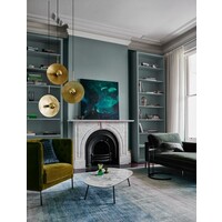
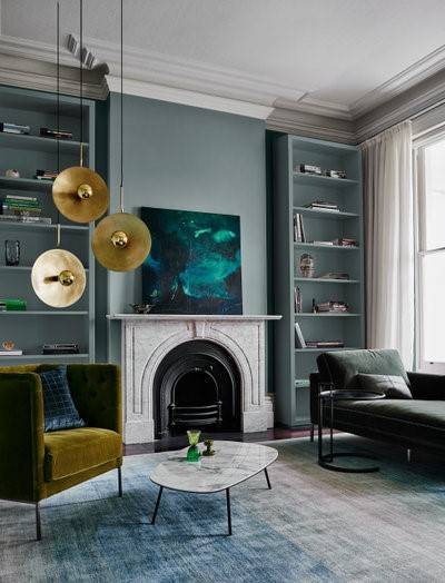
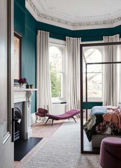
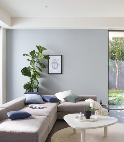
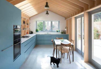
Styling by Bree Leech
Photography by Lisa Cohen
Dulux Goyder Green on walls and shelves; Dulux Lexicon Half used on ceiling and trim
“Certain colours can make us feel calmer, such as blues and greens,” says Andrea Lucena-Orr, colour and communications manager at Dulux Australia. “Blues give us a feeling of tranquility and calmness. Softer blues can also make a room feel more spacious, making them a great tool for smaller spaces.
“Greens feel relaxing and are perfect for living and bedroom spaces. They’re linked to nature and give us the sense of being in our own sanctuary. Greens are also refreshing and easy to live with.
“Colours to avoid, if you are looking to create a calm and tranquil space, include vivid reds, yellows and oranges,” she says.
Email Save
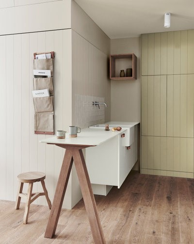
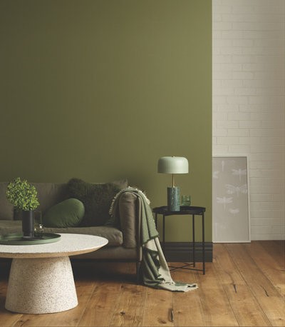
Styling by Bree Leech and Heather Nette King
Photography by Lisa Cohen
Dulux Wash&Wear in Humble Fawn on walls; Dulux Wash&Wear in Wasabi on rear cupboard
A calming palette for living spaces
- Dulux Goyder Green for walls.
- Dulux Lexicon Half for trims.
A calming palette for kitchens
- Dulux Humble Fawn for walls.
- Dulux Wasabi for cabinetry.
Finishes to try
“A textured finish, such as Dulux Suede Effect or Dulux Stone Effect, will help create a sense of calm,” says Lucena-Orr. “Or try soft blue-greens and earthy, neutral colours in a matt finish such as Dulux Wash&Wear Matt.”
Don’t know where to start with your home’s colour palette? Find a decorator on Houzz near you for expert advice
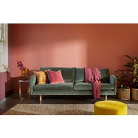
Email Save
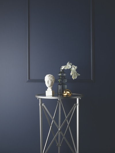
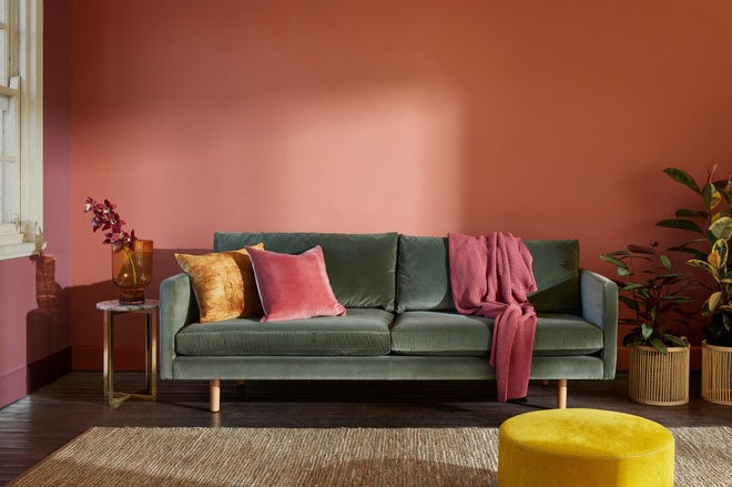
Styling by Bree Leech
Photography by Lisa Cohen
Dulux Deep Aqua on wall; Dulux Lexicon Half on trim
Where to use these palettes
- “Create an accent wall behind the sofa or on a main focal wall, then layer up soft textiles on your sofa and floors to make the space cosy and inviting,” says Lucena-Orr.
- “Or, up the serenity factor by painting one larger wall in blue or green or applying colour to all four walls,” she says.
- “If you don’t want the walls to look too deep or dark, opt for a natural greige with a green undertone such as Dulux Ecru or Dulux Beige Royal,” she says.
Pair these colours with: Timber, linen, leather, metallics and ceramics, suggests Lucena-Orr.
Email Save
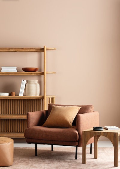
Haymes Paint Toadstool on wall
“Soft, harmonious palettes will create a sense of calm within a space,” says Wendy Rennie, colour and concept manager at Haymes Paint. “It is about colour balance and also the intensity of a colour – the more muted and less contrasting a palette is, the more calming it can be.
“We have two key palettes that represent just this – our Home Grown palette, which incorporates warm and earthy browns with beautiful red undertones; and our Equilibrium palette, a complex blend of pastel and earthy tones.
“To create a soothing space, avoid anything too saturated or intense and look for more complex colours that incorporate tones of earthy brown, grey, black or white,” she says.
Email Save
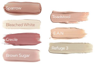
Haymes Paint Home Grown palette
A calming palette for living spaces and kitchens
- Refuge 3 for walls.
- Toadstool and Sparrow as accents for furniture and soft furnishings.
- Bleached White – a soft, bone white for trims.
Finishes to try
“A matt finish gives real depth to a colour as it reflects the least amount of light, which produces a feeling of stillness,” says Rennie. “Or try our Soft Chalk range, which has a calming and quietening influence on a space.”
Email Save
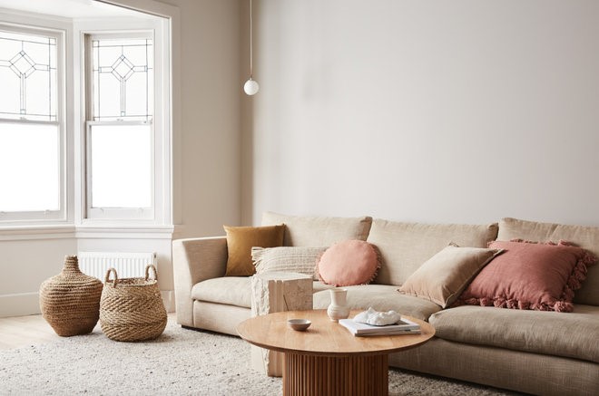
Haymes Paint Refuge 3 on walls
Where to use these palettes
“Use a mid-tone neutral such as Refuge 3 as a base for the walls, soft Bleached White for trims, and incorporate warmer redder-toned hues such as Toadstool and Sparrow into your styling to add warmth and energy to the space,” says Rennie.
Pair these colours with: Natural and organic materials, such as timber and linen.
Email Save
Porter’s Paints Hampton’s Blue on walls
“There are quite a few palettes that offer a calming effect, probably more traditionally greens and blues,” says Melanie Stevenson, marketing manager at Porter’s Paints. “Soft green greys, muted olives, sumptuous teals and delicate celadon green can all create a calming oasis.
“But at Porter’s we believe that there’s more to it than just colour – it’s the way paint colours are created that affects how we see them and the effect they have on us.
“Paint colours made with just two or three colourants can feel hard and soulless, whereas we make colours by layering tints and adding undertones – sometimes up to seven colourants – and this adds complexity, character and depth. The human eye can see tens of thousands of colours and it’s these kind of rich, complicated colours that people find calming. Even reds can offer cosiness and comfort if constructed in this way,” she says.
Email Save
Porter’s Paints Timberline on walls
A calming palette for living spaces
- “Porter’s Timberline in our Capsule Collection, which is a beautiful muted olive that changes from slightly dusty and soft during the day to rich and deep at night when the lamps are on,” says Stevenson.
- “Porter’s Irish Linen.”
A calming palette for kitchens
- “Porter’s Explorer Blue in our Capsule Collection, which is a dusty blue with a warm, red undertone,” says Stevenson.
- “Porter’s Yacht Race in our Capsule Collection – a sophisticated navy.
- “A classic white for trims, such as Porter’s Popcorn or Snow White,” she says.
Pair these colours with: Neutral or grey sofa fabrics, all colours of leather, navy, plum, tan and turquoise cushions and throws.
Email Save
Porter’s Paints Yacht Race on walls
Finishes to try
“Porter’s Eggshell acrylic has superior colour depth and a natural matt finish, designed to display colour in a subtle, matt way. We love to pair it with Porter’s Aqua Enamel for trims – an elegant, satin finish,” says Stevenson.
Where to use these palettes
“Most people like using one wall colour and one trim colour. However, where there is a dado rail or half-wall panelling, you have the opportunity to introduce a third colour,” says Stevenson.
Email Save
Taubmans Dancing Waters (blue walls) and Taubmans Winter Mist (white walls)
“For palettes that evoke a sense of quiet calm and comfort, dial down the hue and look to colours steeped in nature,” says Rachel Lacy, chief coloursmith at Taubmans Australia.
“Avoid high-energy brights such as citrus-toned yellows and oranges, which awaken the senses and heighten alertness.”

Email Save
Taubmans Share palette
A calming palette for living spaces and kitchens
- Taubmans Dancing Waters – a soothing blue.
- Taubmans Winter Mist and Taubmans Blue Shamrock – cool blue greens.
- Accent in grounding Taubmans Shadowed – an earthy greige.
Finishes to try
“Low-sheen or matt finishes will help blur sharp edges and hard surfaces in living spaces by absorbing and softening the light. This creates a gentle, blanketing effect,” says Lacy.
Email Save
Taubmans Dancing Waters on cabinetry; Taubmans Baked Brie on walls and Taubmans Windsor on trims
Where to use these palettes
“Taubmans Dancing Waters is easy to use and equally beautiful in living rooms, kitchens and dining areas,” says Lacy. “Make it the hero of the space, paired with a cool neutral, such as Taubmans Winter Mist and accents in Taubmans Blue Shamrock or Taubmans Shadowed.
“Or, for a more conservative approach, use Taubmans Dancing Waters as the accent to warm neutrals in Taubmans Baked Brie, Turning Taupe or Windsor,” she says.
Pair these colours with: “Timber furniture in barely there stained finishes and decorator pieces made from natural materials such as rattan and terracotta. Simplicity is the key,” says Lacy.
Email Save
Wattyl Red Ochre on walls
“Blues and greens tend to connect us with nature and bring balance and harmony,” says Sarah Stephenson, Wattyl colour specialist and senior brand communications manager.
“Pastels such as soft pinks, lilacs and greys also provide a feeling of serenity and feel uplifting.
“Finally, mid-tone colours that are neither light nor dark tend to vibrate less energy and feel cosy and relaxing. These can be a mix of warm, spicy colours and nature’s greens and browns.”
Email Save
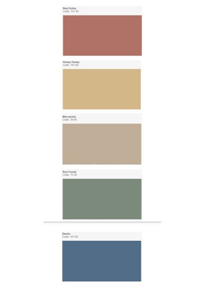
Wattyl colour palette
A calming palette for living spaces and kitchens
Warm and nourishing plant- and nature-based colours such as:
- Wattyl Red Ochre.
- Wattyl Honey Honey.
- Wattyl Moccacino.
- Wattyl Run Forest.
- Wattyl Denim.
Finishes to try
“Matt finishes are soft and soothing,” says Stephenson.
Where to use these palettes
“Depending on how much light you have in a space, a feature corner in spicy terracotta and gold will feel like a beautiful sunset. Alternatively, a green backdrop is great for adding depth to an indoor plant arrangement,” says Stephenson.
“Accents of richer colours are always best layered with a grounding neutral. Experiment with bringing in colour via wall hangings, pots, cushions and rugs,” she says.
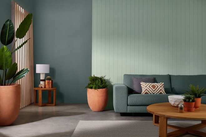
Email Save
Wattyl Cloud on wall behind the sofa and Wattyl Rhino on wall to left of sofa
Pair these colours with: Furniture with rounded corners and soft edges, natural fibres such as recycled wood, cotton and rattan. Keep the styling simple.
Your turn
Which of these palettes would you try in your home? Tell us in the Comments below. And don’t forget to save these images, like this story and join the conversation.
More
Want more on calming colours? Check out 30 Soft Green Spaces to Soothe the Soul
<div id="hzroot6121173" style="width:300px;text-align:center;font-size:12px;padding:0;border:0;margin:0;"><div style="font-size:14px;margin-bottom:3px;"><a href="https://www.houzz.com.au/magazine/5-calming-paint-colour-palettes-for-living-spaces-and-kitchens-stsetivw-vs~134885325" target="_blank">5 Calming Paint Colour Palettes for Living Spaces and Kitchens</a></div><div style="padding:0;margin:0;border:0;margin-bottom:3px;"><iframe data-hzvt="MjAyMDA1MTI6NDIxMTp2aWV3R2FsbGVyeQ==" name="HouzzWidget2463763" id="HouzzWidget2463763" border=0 frameborder="0" SCROLLING=NO style="border:0 none;width:300px;height:275px;" src="https://www.houzz.com.au/jsGalleryWidget/gallery/134885325//new_window=yes/title_on=yes/width=300"></iframe></div></div>


.jpg)