12 No-Fail Ways to Make Any Room Look Better
Author: Judith Taylor Date Posted:14 May 2014
Follow these basic decorating guidelines and your home will look like an interior designer has been visiting...
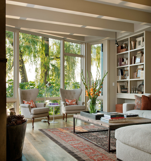
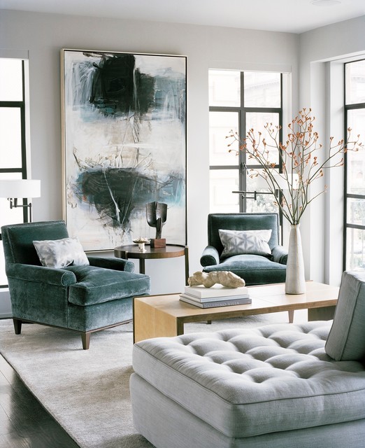
Resist overcrowding a room. Gracious living means space to manoeuvre with ease. This is really great news if you are working with a tight budget. You don’t need to fill up a space with lots of furniture. Spend more of your budget on fewer but better-quality pieces and your room will look better than if it’s stuffed to the gills with flea market finds. The high-backed chairs shown here, for example, stand out because they don’t have to fight for attention.
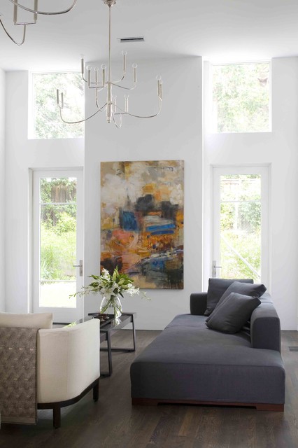
Galleries and museums hang artwork so that the midline (centre) of each piece is 145cm to 152cm from the floor. (The average human eye level is 145 cm.) You should do the same.
In a room like this, where the ceilings soar, there might be a tendency to hang the art higher. But remember, it needs to relate to human scale, not the structure’s scale.
If you’re not sure, take a picture. It’s remarkable how much a photo can reveal. Print it out or use Photoshop or an app to draw on the photo. This can give you a sense of whether a larger or smaller piece of art is needed or a tall plant might be best to fill an empty spot.
There are basically three ways you can arrange furniture on your rug.
ALL ON: The rug is large enough to place all of the furniture legs on top of it. This creates a more luxurious feel. For this, bigger is better. Just be sure to leave at least 30cm to 45cm of surface free on all four sides of the rug.
ALL OFF: If you have a small room, keeping all legs off the rug is a great cost-effective choice. You don’t want to pick too small a rug, though, or it may look insignificant, like an afterthought. The rug should appear as though it could touch the front legs of each of the seating pieces. This approach is best suited when you’re layering a pattern over a larger solid or textured rug.
Shop a wide selection of rugs on Houzz


For example, the Cape Cod look is a very popular request. You know the hallmarks: pine lining, a blue and white colour palette and some ship paintings. But this has been done so many times, it lacks individuality. In this room a coastal vibe was achieved through a palette, artwork and materials that give the effect without drawing on the obvious clichés.

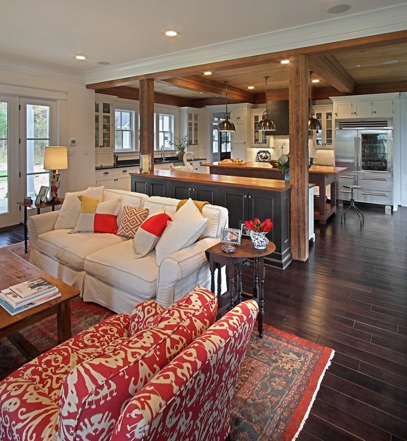
There are leading roles and supporting cast members in any production. The same is true in design. Choose your star and make it the focal point to anchor a room. Allow other items to take a secondary role. Don’t ask everything to have a leading role, it will just result in visual noise.
Your focal point might be a dramatic range hood in the kitchen, a mantle and artwork in the living room or a bedhead in the bedroom. Whatever it is, choose something that will draw attention. In this room the fireplace and the lighting work together as a collective focal point, bringing your eye right to the centre of the composition and anchoring it there.
Your focal point should be free and clear from one room to the next so that it feels like you’re being drawn between them. That’s why the best spot for a focal point is usually directly across from the entrance to the room.
Here a seating arrangement around artwork draws the viewer into the room because the sight line is clear.

Don’t hang on to a piece that just doesn’t fit. I don’t care if your great-aunt Sally gave it to you. If it’s not working for you, then find a new home for it (maybe in a different room).
The unifying theme here is the use of black in the utilitarian pieces. The balance is almost perfect. It reminds me of something fashion designer Coco Chanel said about accessorising: “Before you leave the house, look in the mirror and take one thing off.” In design, know when to stop.

What looks good in a store may look like an elephant in the room when you bring it home, or could be too tiny to be of any significance. So always vary scale and proportion.
The oversize sunburst mirror frame fills up the wall space nicely here, while the sand dollars make an interesting grouping below. The sand dollars would be much too insignificant individually. Threes and fives (odd numbers) make for more pleasing arrangements than even numbers.

In this kitchen seating area, the splashback is lit, the artwork is highlighted and the cabinet interiors are filled with light. One central lighting fixture would not have had nearly the same dramatic result.
Professionals build layers of lighting to create interest, intrigue and variety. In a room where everything is lit evenly, nothing stands out. Pick a focal point and perhaps a secondary focal point and highlight those. Add general ambient lighting and some lower lighting, such as table lamps, for interest.
Personality is what makes a space great. Make your own statement and have fun. The more you try, the more you will begin to see what works and what doesn’t.
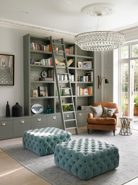
Incorporate unexpected elements for drama. Here, the unconventional ottoman seats, library-style bookshelves and oversized chandelier are all unexpected in a conventional living room, but the result has charisma. Eschew expected pieces and interpretations if you want a room that will create a ‘wow’ effect.
Having some guidelines gives people a good starting point for furnishing their home, even if some of them aren’t practical for a particular space.
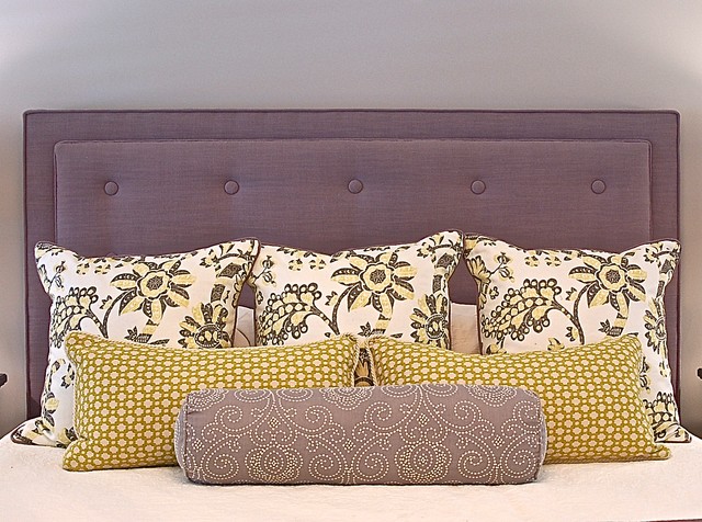
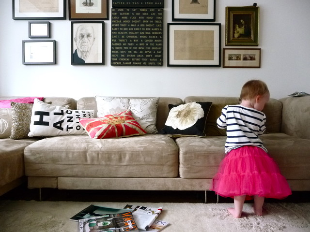
Go with something personal that makes you smile and, above all, is comfortable. Overly designed rooms don’t really translate to modern life. A cushion collection and an art arrangement that are seemingly haphazard, as shown here, create a dressed-down look with plenty of style.
<div id="hzroot3036036" style="width:300px;text-align:center;font-size:12px;padding:0;border:0;margin:0;"><div style="font-size:14px;margin-bottom:3px;"><a href="https://www.houzz.com.au/jsGalleryWidget/gallery/27125248/new_window=no/title_on=no/width=300" target="_blank">12 No-Fail Ways to Make Any Room Look Better</a></div><div style="padding:0;margin:0;border:0;margin-bottom:3px;"><iframe data-hzvt="MjAyMDAzMDM6ZnVuY3Rpb24oKSB7CiAgICBbbmF0aXZlIGNvZGVdCn0=" name="HouzzWidget8809679" id="HouzzWidget8809679" border=0 frameborder="0" SCROLLING=NO style="border:0 none;width:300px;height:275px;" src="https://www.houzz.com.au/jsGalleryWidget/gallery/27125248/new_window=no/title_on=no/width=300"></iframe></div></div>


.jpg)
I get calls all the time from new homeowners who want to pick a paint colour before they move in. I appreciate their logic: why not arrive to walls gleaming with a fresh coat of paint? Of course you can do it this way, but in my opinion it’s not ideal.
There are thousands of paint colours with various tints, tones and shades. And each one looks different from home to home, because light sources vary, meaning what looks good in your current home might not in your new one. You want the colour that best complements your upholstery, artwork, rug and whatever else. You can pick that colour only if your stuff is actually inside your home.